Getting started#
This page walks through Glue’s basic GUI features, using data from the W5 star forming region as an example. You can download the data files for this tutorial here:
After installing Glue, you can launch it by typing:
glue
or by clicking on the Glue icon in the Anaconda Navigator if using it. After a few seconds you should see the main window of glue which looks like this:
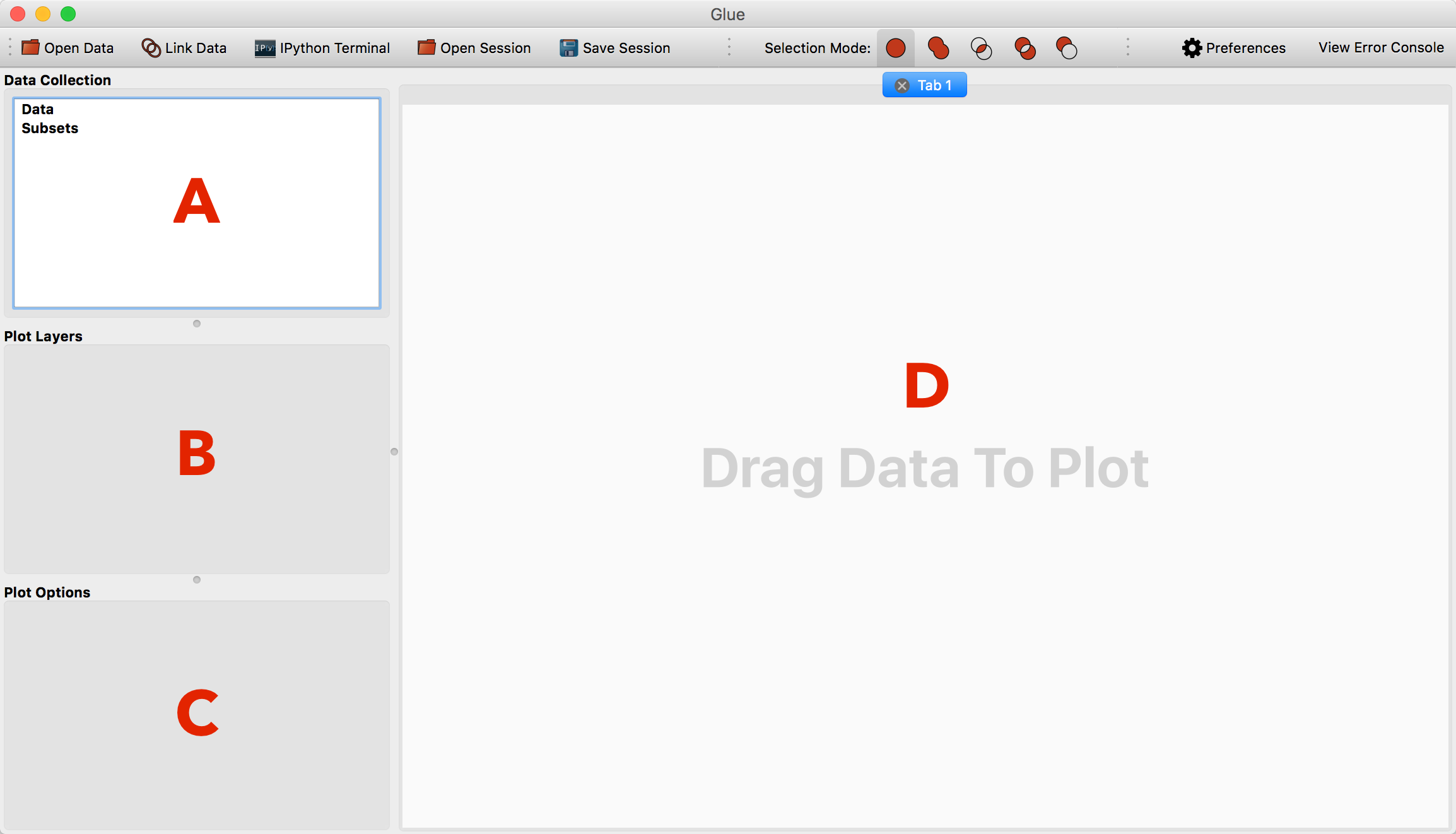
The main window consists of 4 areas:
The data collection. This lists all open data sets and subsets (highlighted regions).
The viewer layers. This is where you will see a list of layers in the current viewer, and be able to control the appearance of individual layers
The viewer options. This is where you will see global options for the active viewer
The visualization canvas. This is where visualization windows resides.
Opening Data#
There are multiple ways to open data:
By clicking on the red folder icon in the top left
By selecting the Open Data Set item under the File menu or using the equivalent shortcut (e.g. Ctrl+O on Linux, Cmd+O on Mac).
By dragging and dropping data files onto the main window
Find and open the file
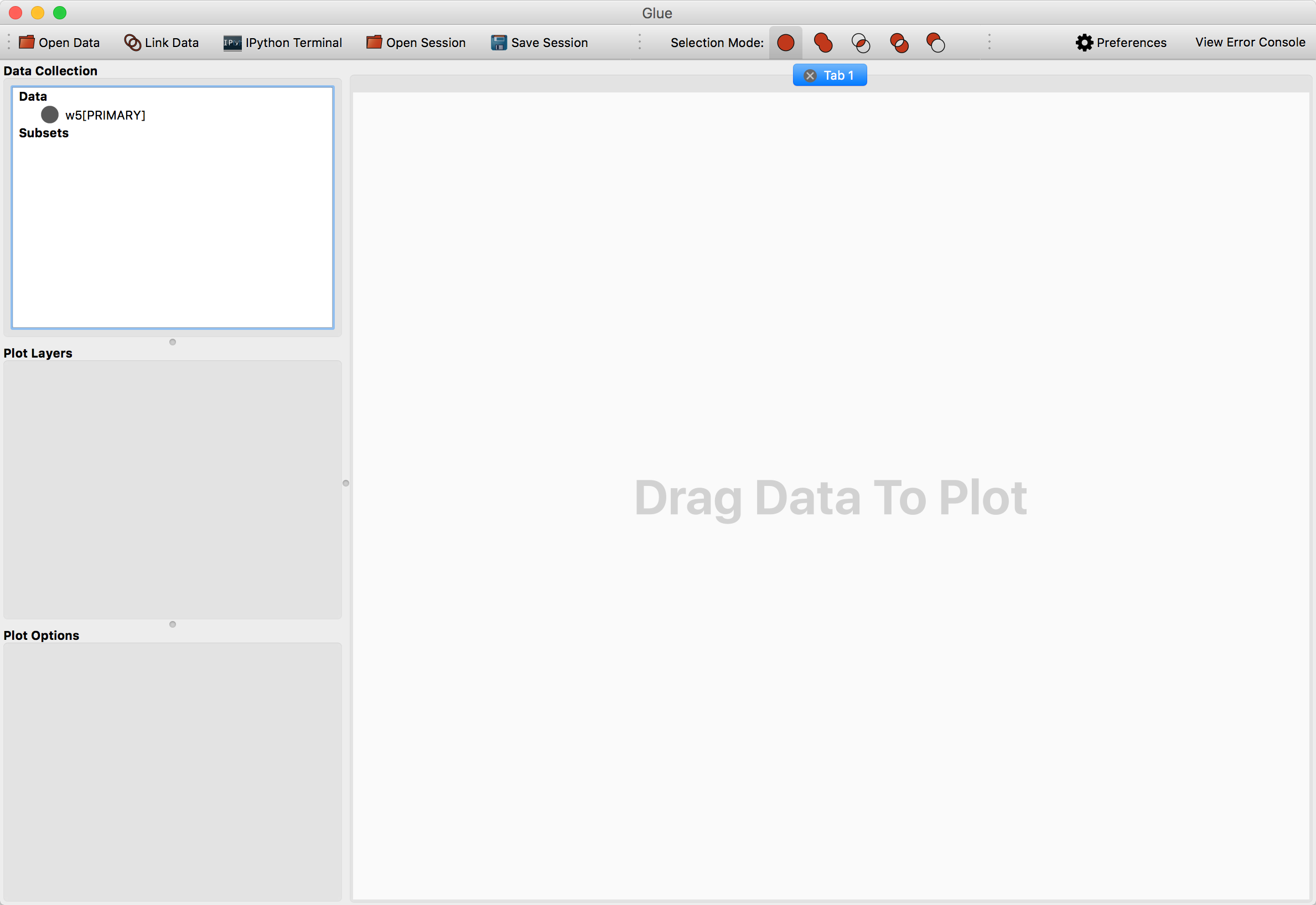
w5.fitswhich should be in thew5.tgzorw5.ziparchive you downloaded above. This is a WISE image of the W5 Star Forming Region. While this is an astronomical dataset, glue can be used for data in any discipline, and many of the concepts shown below are applicable to many types of dataset.
Plotting Data#
After opening w5.fits, a new entry will appear in the data manager:
To visualize a dataset, click and drag the entry from the data manager to the visualization dashboard. A popup window asks about what kind of plot to make. Since this is an image, select 2D Image Viewer.
Defining Subsets#
Work in glue revolves around “drilling down” into interesting subsets within data. Each visualization type (image, scatterplot, …) provides different ways for defining these subsets. In particular, the image window provides 5 options:
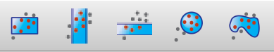
Rectangular selection
Horizontal range
Vertical range
Circular selection
Freeform selection
To use these, click on one of the selection icons then click and drag on the image to define a selection. If using the polygon selection, you should press ‘enter’ when the selection is complete (or ‘escape’ to cancel).
We can highlight the west arm of W5 using the rectangle selector:
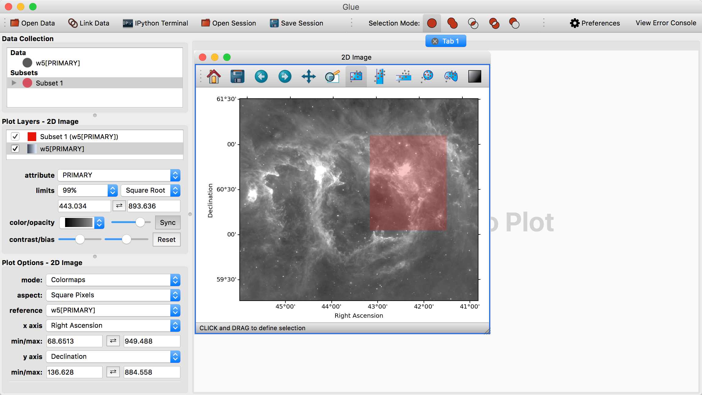
Notice that this highlights the relevant pixels in the image, adds a new subset (named Subset 1) to the data manager, and adds a new visualization layer in the visualization dashboard.
We can redefine this subset by dragging a new rectangle in the image, or we can also move around the current subset by pressing the ‘control’ key and clicking on the subset then dragging it. As long as Subset 1 is selected in the data collection view in the top left, drawing selections will redefine Subset 1. If you deselect this subset and draw a new region, a new subset will be created.
You can edit the properties of a visualization layer (color, transparency, etc.) by clicking on the layer in the Plot layers list on the left. Likewise, you can re-arrange the rows in this widget to change the order in which each layer is drawn – the top entry will appear above all other entries.
Refining Subsets and Linked Views#
Visualizations are linked in Glue – that is, we can plot this data in many different ways, to better understand the properties of each subset. To see this, click and drag the W5[PRIMARY] entry into the visualization area a second time, and make a histogram. Edit the settings in the histogram visualization dashboard to produce something similar to this:
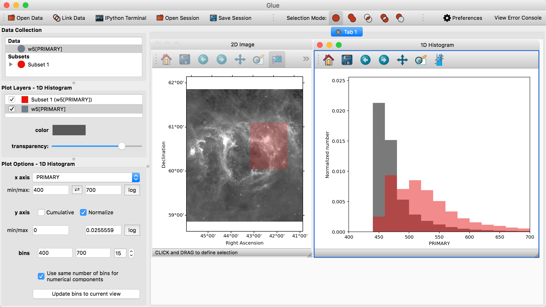
This shows the distribution of intensities for the image as a whole (gray), and for the subset in red (the label PRIMARY comes from the FITS header)
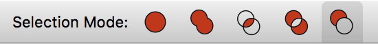
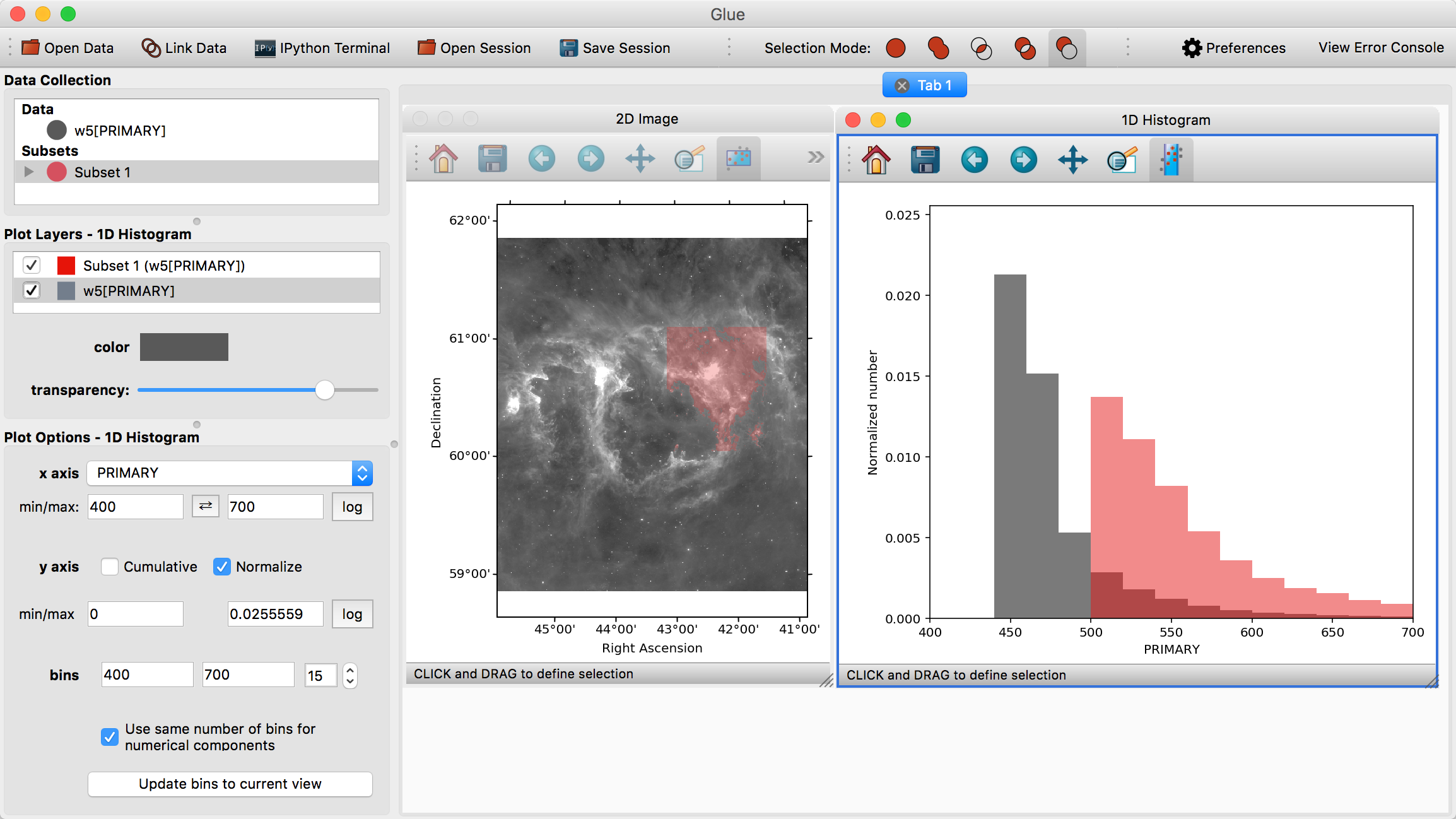
Perhaps we wish to remove faint pixels from our selection. To do this, we pick the last mode (Remove From Selection) from the selection mode toolbar:
When this mode is active, new regions defined by the mouse are subtracted from the selected subsets. We can therefore highlight the region between x=450-500 in the histogram to remove this region from the data.
Note
Make sure you switch back to the first, default selection mode (Replace Selection) once you have finished defining the selection.
Linking Data#
Glue is designed so that visualization and drilldown can span multiple datasets. To do this, we need to inform Glue about the logical connections that exist between each dataset.
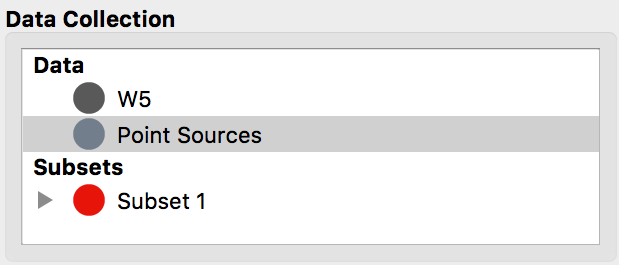
Open the second file, w5_psc.vot – a catalog of Spitzer-identified point
sources towards this region. You will see a new entry in the data manager. We
can double click on that entry to rename it to Point Sources, and the result
will look like this:
At this point, you can visualize and drilldown into this catalog. However, Glue
doesn’t know enough to compare the catalog and image. To do that, we must
Link these two data entries. Click on the Link Data button in the toolbar.
This brings up a new window, showing all the pieces of information within each
dataset:
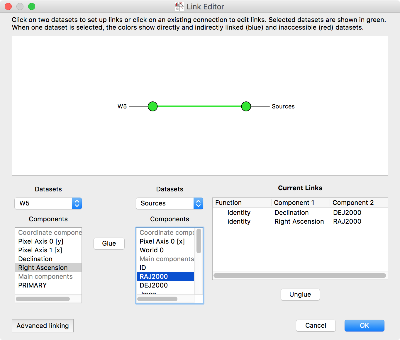
Select the two datasets in the network diagram in the top panel, or from the drop-down menus underneath. The image has an attribute Right Ascension. This is the same quantity as the RAJ2000 attribute in the Point Sources dataset – they are both describing Right Ascension (the horizontal spatial coordinate on the sky). Select these entries, and click Glue to instruct the program that these quantities are equivalent. Likewise, link Declination and DEJ2000 (Declination, the other coordinate). Click OK.
Note
What does this do? This tells Glue how to derive the catalog-defined quantities DEJ2000 and RAJ2000 using data from the image, and vice versa. In this case, the derivation is simple (it aliases the quantity Declination or Right Ascension). In general, the derivation can be more complex (i.e. an arbitrary function that maps quantities in the image to a quantity in the catalog). Glue uses this information to apply subset definitions to different data sets, overplot multiple datasets, etc.
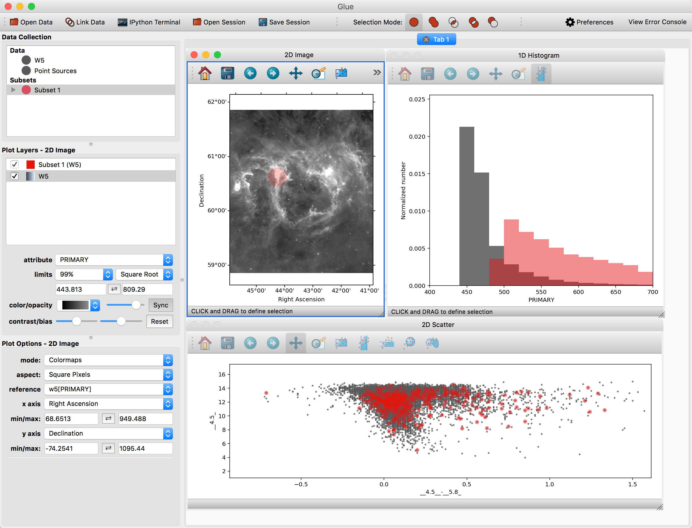
After these connections are defined, subsets that are defined via spatial constraints in the image can be used to filter rows in the catalog. Let’s see how that works.
First, make a scatter plot of the point source catalog. Then, select Subset 1 and draw a new region on the image. You should see this selection applied to all plots:
You can also overplot the catalog rows on top of the image. To do this, click the arrow next to the new subset – this shows the individual selections applied to each dataset. Click and drag the subset for the point source catalog on top of the image. To see these points more easily, you may want to disable the layer showing all the points (named Point Sources) in the list of plot layers.
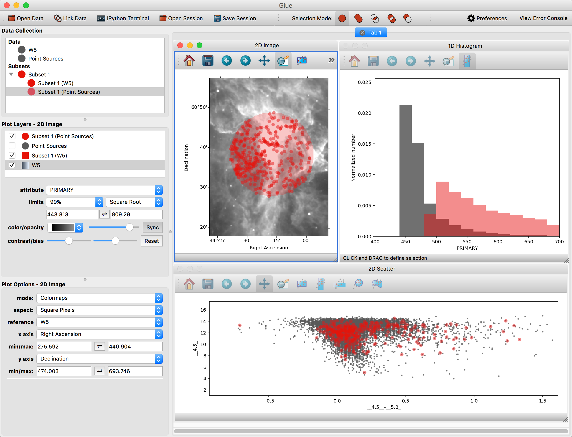
Glue is able to apply this filter to both datasets because it has enough information to apply the spatial constraint in the image (fundamentally, a constraint on Right Ascension and Declination) to a constraint in the catalog (since it could derive those quantities from the RAJ2000 and DEJ2000 attributes).
Tip
Glue stores subsets as sets of constraints – tracing a rectangle subset on a plot defines a set of constraints on the quantities plotted on the x and y axes (left < x < right, bottom < y < top). Copying a subset copies this definition, and pasting it applies the definition to a different subset.
As was mentioned above, the highlighted subsets in the data manager are the ones which are affected by selecting regions in the plots. Thus, instead of manually copy-pasting subsets from the image to the catalog, you can also highlight both subsets before selecting a plot region. This will update both subsets to match the selection.
Note
Careful readers will notice that we didn’t use the image subset from earlier sections when working with the catalog. This is because that selection combined spatial constraints (the original rectangle in the image) with a constraint on intensity (the histogram selection). There is no mapping from image intensity to quantities in the catalog, so it isn’t possible to filter the catalog on that subset. In situations where Glue is unable to apply a filter to a dataset, it doesn’t render the subset in the visualization.
Saving your work#
Glue provides a number of ways to save your work, and to export your work for further analysis in other programs.
Saving The Session
You can save a Glue session for later work via the Save Session button in
the toolbar or in the File menu. This creates a glue session file (the
preferred file extension is .glu). You can restore this session later via
the Open Session button in the toolbar or in the File menu.
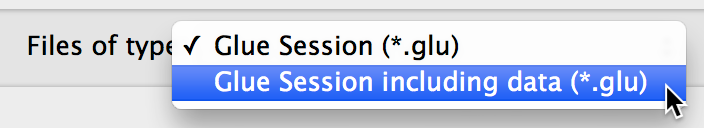
By default, these files store references to the files you opened, and not copies of the files themselves. Thus, you won’t be able to re-load this session if you move any of the original data. To include the data in the session file, you can select ‘Glue Session including data’ when saving:
Saving Plots
Static images of individual visualizations can be saved by clicking the floppy disk icon on a given visualization window. There are also exporters available under the File menu - built-in exporters include one to export plots to the plotly service, and one to export plots using D3PO.
Saving Subsets
Glue is primarily an exploration environment – eventually, you may want to export subsets for further analysis. Glue currently supports saving subsets as FITS masks. Right click on the subset in the data manager (note that you need to select the subset applied to a specific dataset, not the overall subset, so be sure to expand the subset by clicking on the triangle on the left of the subset name), and select Export subset values or Export subset mask(s) to write the subset to disk.