Frequently Asked Questions#
This page contains commonly asked questions about using Glue. For more technical issues in installing or running Glue, see the Known issues and solutions page.
What data formats does Glue understand?#
Glue relies on several libraries to parse different file formats:
Astropy for FITS images and tables, a variety of ascii table formats, and VO tables.
scikit-image to read popular image formats like
.jpegand.tiffh5py to read HDF5 files
If Glue’s predefined data loaders don’t fit your needs, you can also write your own loader, and plug it into Glue.
How do I overplot catalogs on images in Glue?#
Take a look at this video. For more details, consult the tutorial.
How do I use Glue with the IPython notebook?#
For IPython version >= 4.0, Glue can be started from a Jupyter notebook without blocking, so that both the notebook and the Glue UI can run at once. This requires running the following magic function:
%gui qt
And then starting glue (probably by calling qglue or creating an
instance of GlueApplication) from the
notebook.
If you encounter an error like this:
ValueError: API 'QString' has already been set to version 1
set the QT_API environment variable to either pyqt, pyqt5, or
pyside, depending on which version of Qt you have installed:
QT_API=pyside ipython notebook --gui qt
Does Glue Understand CASA Cubes?#
Many radio astronomy datacubes are 4 dimensional, and give intensity as a function of 2 spatial dimensions, a frequency dimension, and a Stokes polarization dimension. By default, Glue will read these FITS images in as 4D hypercubes (use the task exportfits in CASA to write a native CASA image into a FITS cube that glue can read).
However, you might wish to load the image as a series of 3D cubes, one for each Stokes parameter. This would more easily allow you, for example, to compare histograms of intensities for each Stokes parameter.
Because of this, Glue has a special “CASA image loader”, to load these kinds of files. To open a file in this mode, select “CASA PPV Cube” in the file type dropdown when opening a file. This will create a single Data object with 1 attribute for each Stokes parameter.
Something is broken, or confusing. What should I do?#
If you think you have found a bug in Glue, feel free to add an issue to the GitHub issues page. If you have general questions, feel free to post a message to the Glue mailing list, or send us an email directly.
You can also submit bug reports directly from Glue, by clicking Help->Send
Feedback. This also sends us some diagnostic information about your Glue
installation.
How do I make a scatterplot of columns from two different catalogs?#
Merge the two datasets into a single object.
How do I make a scatterplot between two images?#
Merge the two datasets into a single object, like you do for catalogs. This will only work if the two images have exactly the same shape (although it does not check if the WCS is the same). You can then drag the merged object into the visualization area to view an image of the first attribute. Repeat a second time to view the second image, and finally create a scatterplot comparing the image intensities at each pixel. You can then select regions in any of the three plots, and the corresponding selections in the other plots will be highlighted. Another interesting way to visualize your two related images is drop a fourth object using 2D Image Viewer, but this time select the RGB instead of Monochrome, and put each image into one of the colors. Right mouse down will change the Contrast selected color after you have selected the bias/contrast button on the top row. Obviously with three images this is a great way to create a colorful RGB image.
A note on brushing in the image. If you want to just highlight a single pixel (pretty easy once you zoom in), you need to make sure your rectangular selection has its top right selection in that pixel. You cannot just highlight inside the pixel, it needs to cross boundaries between pixels.
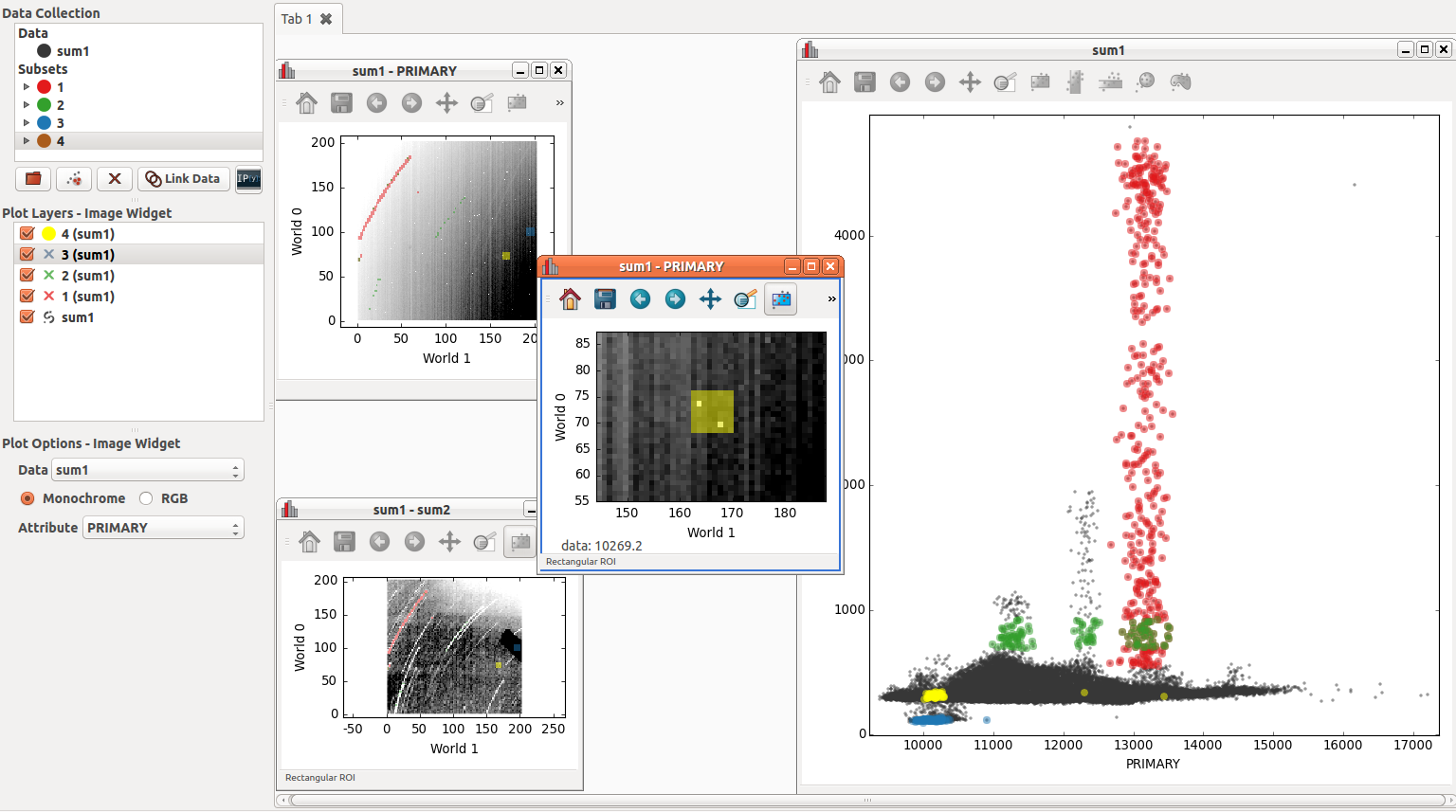
The intensity in image SUM1 and image SUM2 are correlated in the scatter plot. A second image of SUM1 is zoomed in around two warm pixels to see where they show up in the scatter plot (in yellow). In this particular diagram one can see that warm pixels follow the same relationship between SUM1 and SUM2 and the colder pixels.
I have some other question…?#
Ask us a question on the mailing list!