Writing a simple custom data viewer#
Glue’s standard data viewers (scatter plots, images, histograms) are useful in a wide variety of data exploration settings. However, they represent a tiny fraction of the ways to view a particular dataset. For this reason, Glue provides a way to create more data viewers that me better suited to what you need.
There are several ways to do this - the tutorial on this page shows the easiest way for users to develop a new custom visualization, provided that it can be made using Matplotlib and that you don’t want do have to do any GUI programming. If you are interested in building more advanced custom viewers, see Writing a custom viewer for glue with Qt.
The Goal: Basketball Shot Charts#
In basketball, Shot Charts show the spatial distribution of shots for a particular player, team, or game. The New York Times has a nice example.
There are three basic features that we might want to incorporate into a shot chart:
The distribution of shots (or some statistic like the success rate), shown as a heatmap in the background.
The locations of a particular subset of shots, perhaps plotted as points in the foreground
The relevant court markings, like the 3-point line and hoop location.
We’ll build a Shot Chart in Glue incrementally, starting with the simplest code that runs.
Shot Chart Version 1: Heatmap and plot#
Our first attempt at a shot chart will draw the heatmap of all shots, and overplot shot subsets as points. Here’s the code:
 1from glue import custom_viewer
 2
 3from matplotlib.colors import LogNorm
 4
 5bball = custom_viewer('Shot Plot',
 6                      x='att(x)',
 7                      y='att(y)')
 8
 9
10@bball.plot_data
11def show_hexbin(axes, x, y):
12    axes.hexbin(x, y,
13                cmap='Purples',
14                gridsize=40,
15                norm=LogNorm(),
16                mincnt=1)
17
18
19@bball.plot_subset
20def show_points(axes, x, y, style):
21    axes.plot(x, y, 'o',
22              alpha=style.alpha,
23              mec=style.color,
24              mfc=style.color,
25              ms=style.markersize)
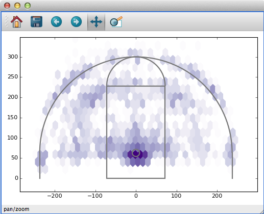
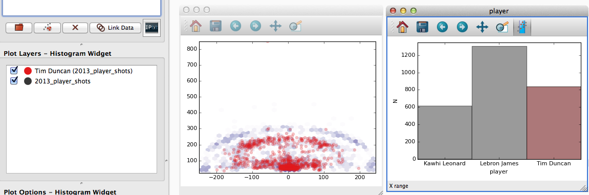
Before looking at the code itself, let’s look at how it’s used. If you include or import this code in your config.py file, Glue will recognize the new viewer. Open this shot catalog, and create a new shot chart with it. You’ll get something that looks like this:
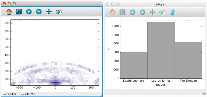
Furthermore, subsets that we define (e.g., by selecting regions of a histogram) are shown as points (notice that Tim Duncan’s shots are concentrated closer to the hoop).
Let’s look at what the code does. Line 5 creates a new custom viewer,
and gives it the name Shot Plot. It also specifies x and y keywords which we’ll come back to shortly (spoiler: they tell Glue to
pass data attributes named x and y to show_hexbin).
Line 11 defines a show_hexbin function, that visualizes a dataset
as a heatmap. Furthermore, the decorator on line 10 registers this
function as the plot_data function, responsible for visualizing a dataset as a whole.
Custom functions like show_hexbin can accept a variety of input
arguments, depending on what they need to do. Glue looks at the names
of the inputs to decide what data to pass along. In the case of this
function:
Arguments named
axescontain the Matplotlib Axes object to draw with
xandywere provided as keywords tocustom_viewer. They contain the data (as arrays) corresponding to the attributes labeledxandyin the catalog
The function body itself is pretty simple – we just use the
x and y data to build a hexbin plot in Matplotlib.
Lines 19-25 follow a similar structure to handle the visualization of subsets, by defining a plot_subset function. We make use of the
style keyword, to make sure we choose colors, sizes, and
opacities that are consistent with the rest of Glue. The value passed
to the style keyword is a VisualAttributes
object.
Custom data viewers give you the control to visualize data how you want, while Glue handles all the tedious bookkeeping associated with updating plots when selections, styles, or datasets change. Try it out!
Still, this viewer is pretty limited. In particular, it’s missing court markings, the ability to select data in the plot, and the ability to interactively change plot settings with widgets. Let’s fix that.
Shot Chart Version 2: Court markings#
We’d like to draw court markings to give some context to the heatmap. This is independent of the data, and we only need to render it once. Just as you can register data and subset plot functions, you can also register a setup function that gets called a single time, when the viewer is created. That’s a good place to draw court markings:
 1from glue import custom_viewer
 2
 3from matplotlib.colors import LogNorm
 4from matplotlib.patches import Circle, Rectangle, Arc
 5from matplotlib.lines import Line2D
 6
 7bball = custom_viewer('Shot Plot',
 8                      x='att(x)',
 9                      y='att(y)')
10
11
12@bball.plot_data
13def show_hexbin(axes, x, y):
14    axes.hexbin(x, y,
15                cmap='Purples',
16                gridsize=40,
17                norm=LogNorm(),
18                mincnt=1)
19
20
21@bball.plot_subset
22def show_points(axes, x, y, style):
23    axes.plot(x, y, 'o',
24              alpha=style.alpha,
25              mec=style.color,
26              mfc=style.color,
27              ms=style.markersize)
28
29
30@bball.setup
31def draw_court(axes):
32
33    c = '#777777'
34    opts = dict(fc='none', ec=c, lw=2)
35    hoop = Circle((0, 63), radius=9, **opts)
36    axes.add_patch(hoop)
37
38    box = Rectangle((-6 * 12, 0), 144, 19 * 12, **opts)
39    axes.add_patch(box)
40
41    inner = Arc((0, 19 * 12), 144, 144, theta1=0, theta2=180, **opts)
42    axes.add_patch(inner)
43
44    threept = Arc((0, 63), 474, 474, theta1=0, theta2=180, **opts)
45    axes.add_patch(threept)
46
47    opts = dict(c=c, lw=2)
48    axes.add_line(Line2D([237, 237], [0, 63], **opts))
49    axes.add_line(Line2D([-237, -237], [0, 63], **opts))
50
51    axes.set_ylim(0, 400)
52    axes.set_aspect('equal', adjustable='datalim')
This version adds a new draw_court function at Line 30. Here’s the result:
Shot Chart Version 3: Widgets#
There are several parameters we might want to tweak about our visualization as we explore the data. For example, maybe we want to toggle between a heatmap of the shots, and the percentage of successful shots at each location. Or maybe we want to choose the bin size interactively.
The keywords that you pass to custom_viewer() allow you to
set up this functionality. Keywords serve two purposes: they define
new widgets to interact with the viewer, and they define keywords to pass
onto drawing functions like plot_data.
For example, consider this version of the Shot Plot code:
 1from glue import custom_viewer
 2
 3from matplotlib.colors import LogNorm
 4from matplotlib.patches import Circle, Rectangle, Arc
 5from matplotlib.lines import Line2D
 6import numpy as np
 7
 8bball = custom_viewer('Shot Plot',
 9                      x='att(x)',
10                      y='att(y)',
11                      bins=(10, 100),
12                      hitrate=False,
13                      color=['Reds', 'Purples'],
14                      hit='att(shot_made)')
15
16
17@bball.plot_data
18def show_hexbin(axes, x, y, style,
19                hit, hitrate, color, bins):
20    if hitrate:
21        axes.hexbin(x, y, hit,
22                    reduce_C_function=lambda x: np.array(x).mean(),
23                    cmap=color,
24                    gridsize=bins,
25                    mincnt=5)
26    else:
27        axes.hexbin(x, y,
28                    cmap=color,
29                    gridsize=bins,
30                    norm=LogNorm(),
31                    mincnt=1)
32
33
34@bball.plot_subset
35def show_points(axes, x, y, style):
36    axes.plot(x, y, 'o',
37              alpha=style.alpha,
38              mec=style.color,
39              mfc=style.color,
40              ms=style.markersize)
41
42
43@bball.setup
44def draw_court(axes):
45
46    c = '#777777'
47    opts = dict(fc='none', ec=c, lw=2)
48    hoop = Circle((0, 63), radius=9, **opts)
49    axes.add_patch(hoop)
50
51    box = Rectangle((-6 * 12, 0), 144, 19 * 12, **opts)
52    axes.add_patch(box)
53
54    inner = Arc((0, 19 * 12), 144, 144, theta1=0, theta2=180, **opts)
55    axes.add_patch(inner)
56
57    threept = Arc((0, 63), 474, 474, theta1=0, theta2=180, **opts)
58    axes.add_patch(threept)
59
60    opts = dict(c=c, lw=2)
61    axes.add_line(Line2D([237, 237], [0, 63], **opts))
62    axes.add_line(Line2D([-237, -237], [0, 63], **opts))
63
64    axes.set_ylim(0, 400)
65    axes.set_aspect('equal', adjustable='datalim')
This code passes 4 new keywords to custom_viewer():
bins=(10, 100)adds a slider widget, to choose an integer between 10 and 100. We’ll use this setting to set the bin size of the heatmap.
hitrate=Falseadds a checkbox. We’ll use this setting to toggle between a heatmap of total shots, and a map of shot success rate.
color=['Reds', 'Purples']creates a dropdown list of possible colormaps to use for the heatmap.
hit='att(shot_made)'behaves like the x and y keywords from earlier – it doesn’t add a new widget, but it will pass the shot_made data along to our plotting functions.
This results in the following interface:
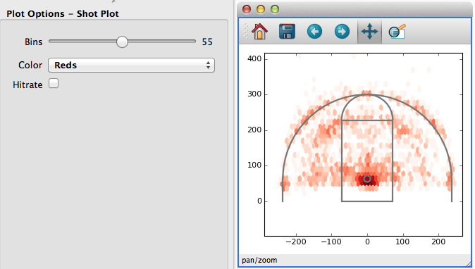
Whenever the user changes the settings of these widgets, the drawing functions are re-called. Furthermore, the current setting of each widget is available to the plotting functions:
binsis set to an integer
hitrateis set to a boolean
coloris set to'Reds'or'Purples'
x,y, andhitare passed asAttributeWithInfoobjects (which are just numpy arrays with a specialidattribute, useful when performing selection below).
The plotting functions can use these variables to draw the appropriate
plots – in particular, the show_hexbin function chooses
the binsize, color, and aggregation based on the widget settings.
Shot Chart Version 4: Selection#
One key feature still missing from this Shot Chart is the ability to
select data by drawing on the plot. To do so, we need to write a
select function that computes whether a set of data points are
contained in a user-drawn region of interest:
1def select(roi, x, y):
2    return roi.contains(x, y)
3
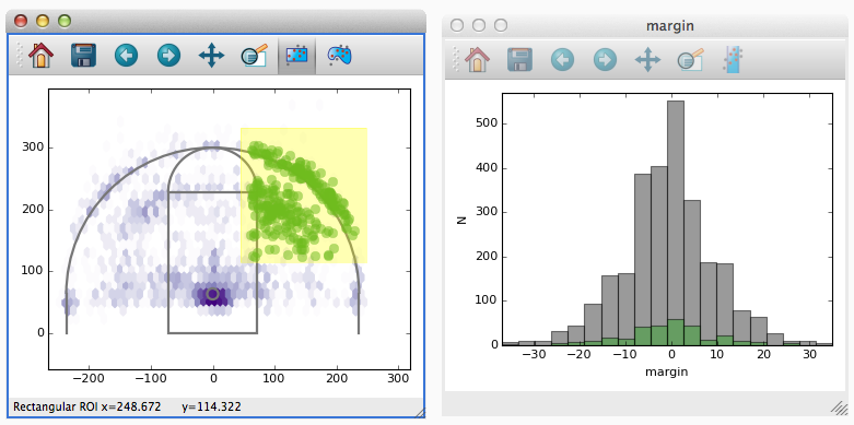
With this version of the code you can how draw shapes on the plot to select data:
Viewer Subclasses#
The shot chart example used decorators to define custom plot functions.
However, if your used to writing classes you can also subclass
CustomViewer directly. The code is largely the
same:
 1from glue_qt.viewers.custom import CustomViewer
 2
 3from glue.core.subset import RoiSubsetState
 4
 5from matplotlib.colors import LogNorm
 6from matplotlib.patches import Circle, Rectangle, Arc
 7from matplotlib.lines import Line2D
 8import numpy as np
 9
10
11class BBall(CustomViewer):
12    name = 'Shot Plot'
13    x = 'att(x)'
14    y = 'att(y)'
15    bins = (10, 100)
16    hitrate = False
17    color = ['Reds', 'Purples']
18    hit = 'att(shot_made)'
19
20    def make_selector(self, roi, x, y):
21
22        state = RoiSubsetState()
23        state.roi = roi
24        state.xatt = x.id
25        state.yatt = y.id
26
27        return state
28
29    def plot_data(self, axes, x, y,
30                  hit, hitrate, color, bins):
31        if hitrate:
32            axes.hexbin(x, y, hit,
33                        reduce_C_function=lambda x: np.array(x).mean(),
34                        cmap=color,
35                        gridsize=bins,
36                        mincnt=5)
37        else:
38            axes.hexbin(x, y,
39                        cmap=color,
40                        gridsize=bins,
41                        norm=LogNorm(),
42                        mincnt=1)
43
44    def plot_subset(self, axes, x, y, style):
45        axes.plot(x, y, 'o',
46                  alpha=style.alpha,
47                  mec=style.color,
48                  mfc=style.color,
49                  ms=style.markersize)
50
51    def setup(self, axes):
52
53        c = '#777777'
54        opts = dict(fc='none', ec=c, lw=2)
55        hoop = Circle((0, 63), radius=9, **opts)
56        axes.add_patch(hoop)
57
58        box = Rectangle((-6 * 12, 0), 144, 19 * 12, **opts)
59        axes.add_patch(box)
60
61        inner = Arc((0, 19 * 12), 144, 144, theta1=0, theta2=180, **opts)
62        axes.add_patch(inner)
63
64        threept = Arc((0, 63), 474, 474, theta1=0, theta2=180, **opts)
65        axes.add_patch(threept)
66
67        opts = dict(c=c, lw=2)
68        axes.add_line(Line2D([237, 237], [0, 63], **opts))
69        axes.add_line(Line2D([-237, -237], [0, 63], **opts))
70
71        axes.set_ylim(0, 400)
72        axes.set_aspect('equal', adjustable='datalim')
Valid Function Arguments#
The following argument names are allowed as inputs to custom viewer functions:
Any UI setting provided as a keyword to
glue.custom_viewer(). The value passed to the function will be the current setting of the UI element.
axesis the matplotlib Axes object to draw to
roiis theglue.core.roi.Roiobject a user created – it’s only available inmake_selection.
styleis available toplot_dataandplot_subset. It is theVisualAttributesassociated with the subset or dataset to draw
stateis a general purpose object that you can use to store data with, in case you need to keep track of state in between function calls.
UI Elements#
Simple user interfaces are created by specifying keywords to
custom_viewer() or class-level variables to
CustomViewer subclasses. The type of
widget, and the value passed to plot functions, depends on the value
assigned to each variable. See custom_viewer() for
information.
Other Guidelines#
You can find other example data viewers at glue-viz/example_data_viewers. Contributions to this repository are welcome!
Glue auto-assigns the z-order of data and subset layers to the values [0, N_layers - 1]. If you have elements you want to plot in the background, give them a negative z-order
Glue tries to keep track of the plot layers that each custom function creates, and auto-deletes old layers. This behavior can be disabled by setting
viewer.remove_artists=False. Likewise,plot_dataandplot_subsetcan explicitly return a list of newly-created artists. This might be more efficient if your plot is very complicated.By default, Glue sets the margins of figures so that the space between axes and the edge of figures is constant in absolute terms. If the default values are not adequate for your viewer, you can set the margins in the
setupmethod of the custom viewer by doing e.g.:axes.resizer.margins = [0.75, 0.25, 0.5, 0.25]where the list gives the
[left, right, bottom, top]margins in inches.